designing for next-gen homebuyers
A strategic redesign of the Rocket Mortgage purchase flow, introducing educational entry points that increased user preference by 70% without disrupting the core experience.
Role:
Product Design Intern
Product Design
Intern
Tools:
Figma + FigJam
Maze
Rocket Design System
Microsoft Office Suite
Key Focus:
Visual Strategy
Cultural Research
Behavioral Analytics
Project Duration :
May 2025 - August 2025
Overview:
Architecting the Gen Z Purchase Journey
Architecting the Gen Z Purchase Journey
Architecting the Gen Z Purchase Journey
I spearheaded the redesign of Rocket Mortgage’s purchase experience, specifically engineered for the 18–28 demographic. Analytics revealed a significant gap in engagement and conversion among Gen Z users, which prompted an intensive study into their unique financial behaviors and digital expectations.
Using these behavioral insights as my foundation, I challenged traditional fintech design systems to create a mobile-first, high-integrity pathway. By testing iterations that prioritized radical transparency and conversational flow, I developed a visual strategy tailored to how the next generation navigates the complexities of digital finance.
PROBLEM:
Bridging the Generational Trust Gap
Bridging the Generational Trust Gap
Bridging the Generational Trust Gap
While Gen Z accounts for less than 3% of current homebuyers, they represent the future of the market. However, this demographic faces unique barriers, from economic setbacks to a deep-seated skepticism toward traditional administrative systems.
For a brand like Rocket Mortgage, whose mission is "Helping Everyone Home," the challenge was more than just a low conversion rate. The real problem was a visual and narrative misalignment: legacy fintech patterns felt cold and opaque to a generation that demands radical transparency, inclusivity, and digital-first simplicity. I needed to bridge this gap by translating Rocket’s brand promise into a visual language that felt earned, not just marketed.
SOLUTION:
Reimagining Design and Content for a Gen Z Mindset
Reimagining Design and Content for a Gen Z Mindset
Reimagining Design and Content for a Gen Z Mindset
Personalize the “Purchase” page to reflect Gen Z’s conversational style through vibrant, inclusive visuals and interactive elements that build trust and engagement from the first click.
SOLUTION FEATURES:
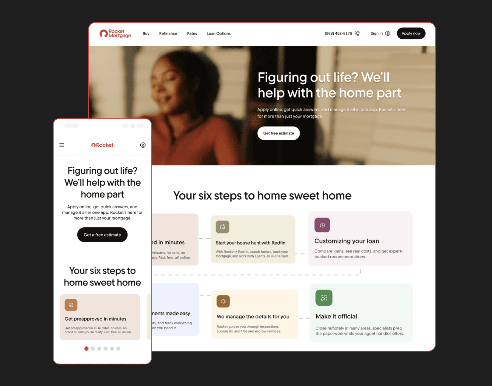
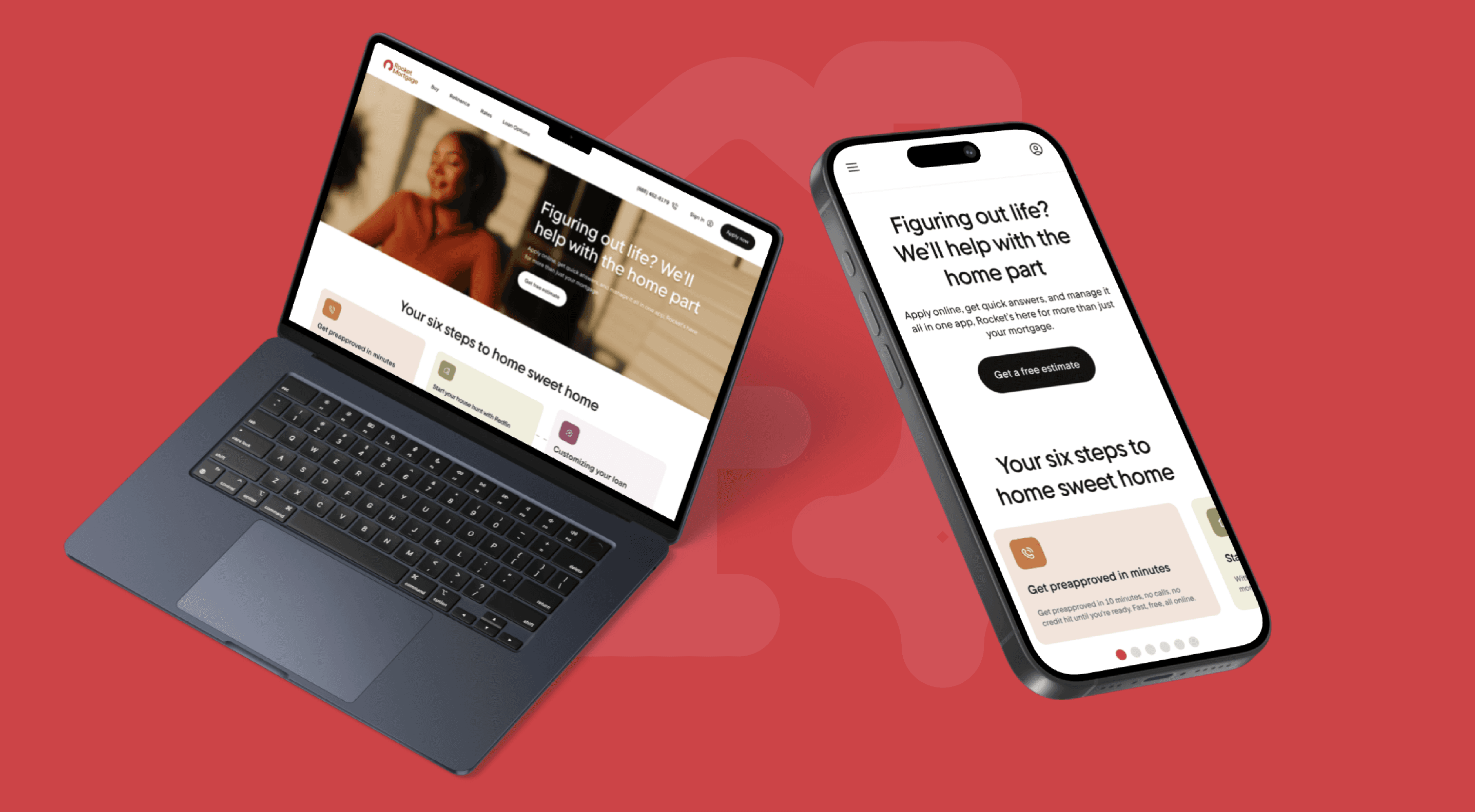
Your Six Steps to Home Sweet Home - Mobile Carousel
Your Six Steps to Home Sweet Home - Mobile Carousel
Your Six Steps to Home Sweet Home - Mobile Carousel
A mobile-first carousel that guides users through the home-buying process step by step. Partial visibility of the next item and progressive disclosure keep users engaged while making complex content more digestible.
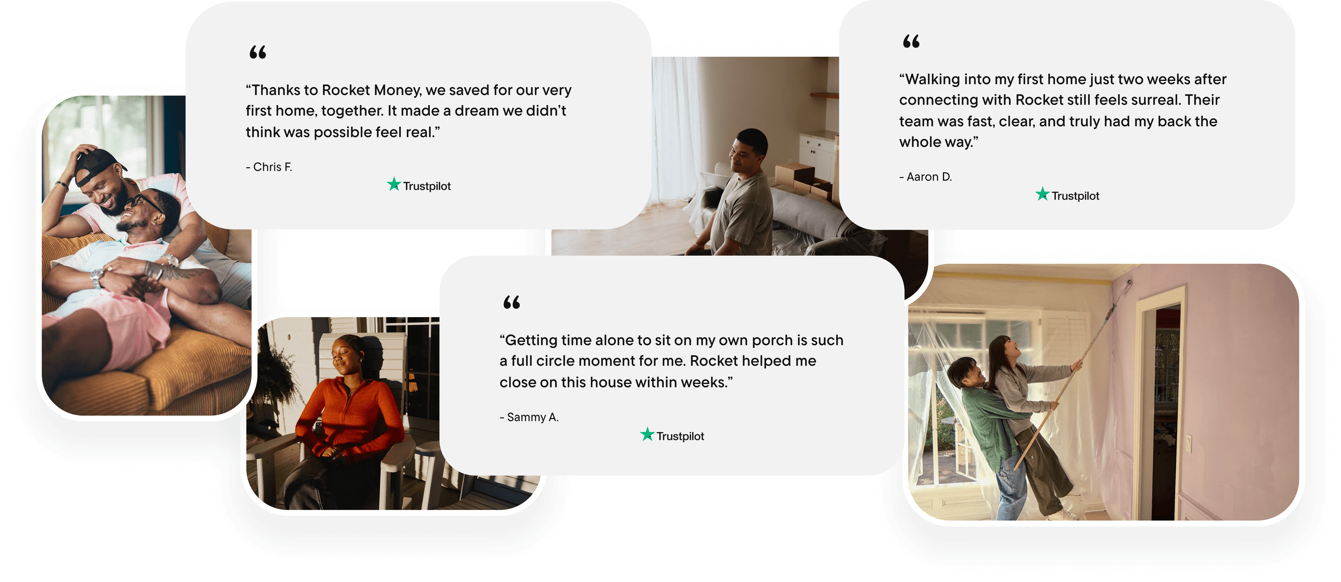
More Relatable, Diverse Imagery
More Relatable, Diverse Imagery
More Relatable, Diverse Imagery
Created testimonial imagery featuring real Rocket customers and couples, with diverse and LGBTQ+ representation, to make the home-buying experience feel welcoming and inclusive. This approach addresses real-world inequities in homeownership, helps build trust with underrepresented audiences, and reinforces Rocket’s mission of truly “Helping Everyone Home.”
Reframing homebuying as a journey, not a destination
Reframing homebuying as a journey, not a destination
Reframing homebuying as a journey, not a destination
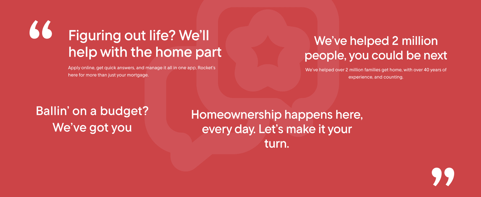
Redesigned content to reflect Rocket’s confidence and empathy, positioning homebuying as a journey, not a sales push, meeting Gen Z where they are with language that feels approachable, honest, and pressure-free.
Results:
A Clear Winner: 70% of Users Favored the Redesign
A Clear Winner: 70% of Users Favored the Redesign
A Clear Winner: 70% of Users Favored the Redesign
Six-step flowchart made the process clear and approachable
Colors reduced intimidation and improved engagement
Diverse imagery increased relatability
Users were 50% more likely to choose Rocket after the redesign
RESEARCH GOALS & QUESTIONS:
How might we make home-buying approachable, engaging, and confidence-inspiring for Gen Z, while reflecting their digital behaviors, values, and diverse identities?
How Might We Make Home-Buying Approachable, Engaging, and Confidence-Inspiring for Gen Z, while Reflecting Their Digital Behaviors, Values, and Diverse Identities?
How might we make home-buying approachable, engaging, and confidence-inspiring for Gen Z, while reflecting their digital behaviors, values, and diverse identities?
First Impression test
Did Gen Z trust the design at first glance?
Did Gen Z trust the design at first glance?
Users viewed a draft redesign for a few seconds and shared immediate reactions, helping me gauge if the design felt trustworthy, easy to follow, and if anything needed to be changed.
Testing the design: comparing original vs. New Design
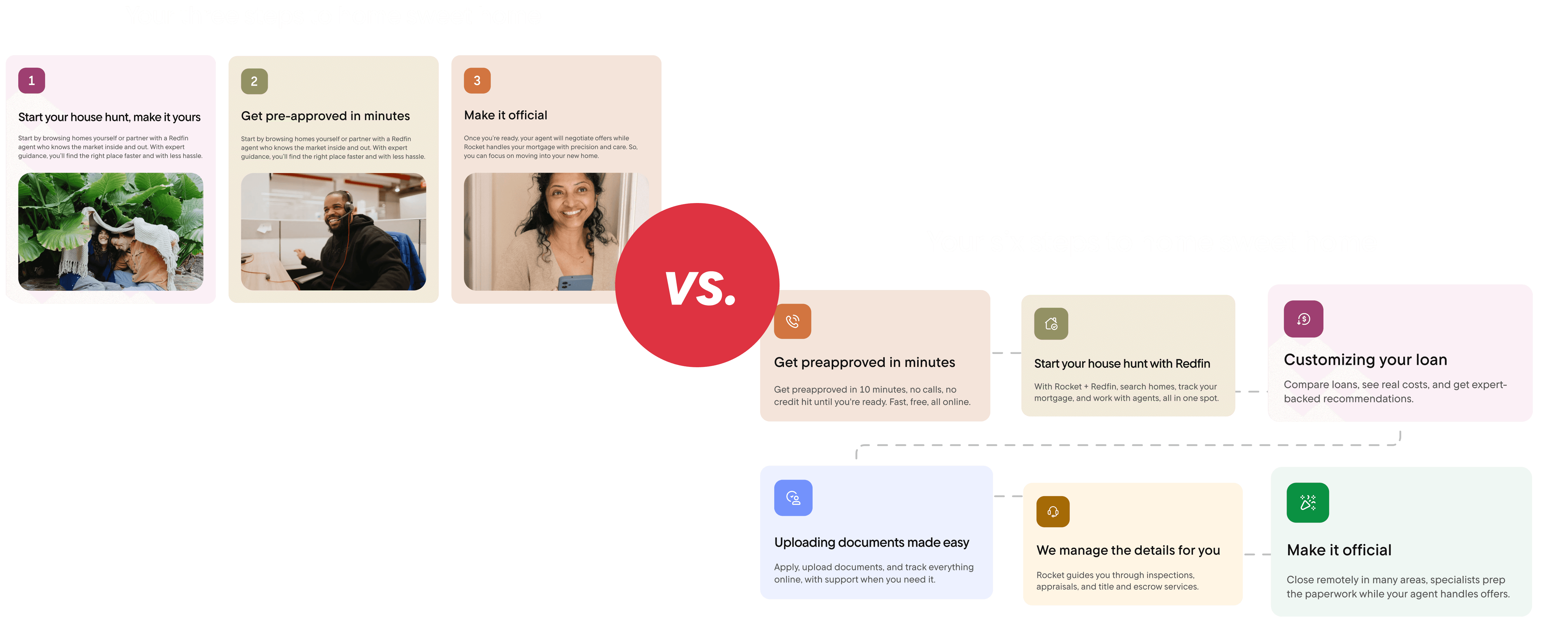
Is Three Steps or Six Steps the Sweet Spot?
Is Three Steps or Six Steps the Sweet Spot?
Initial testing revealed that users found the three-step flow too simplified, making the home-buying process feel unrealistic and incomplete. Feedback highlighted the need for a design that felt more transparent and trustworthy.
DEsign Iteration
To address this, I redesigned the experience into a six-step roadmap, providing a clearer, more detailed breakdown of the process. I also shifted from heavy use of imagery to a visual roadmap format, which reduced cognitive overload and helped users focus on the steps themselves.
IMpact
Six Steps Is the Sweet Spot!
Six Steps Is the Sweet Spot!
The new design was seen as more eye-catching, approachable, and realistic, helping users better understand and engage with the process.
Testing the Design: comparing original vs. New Design
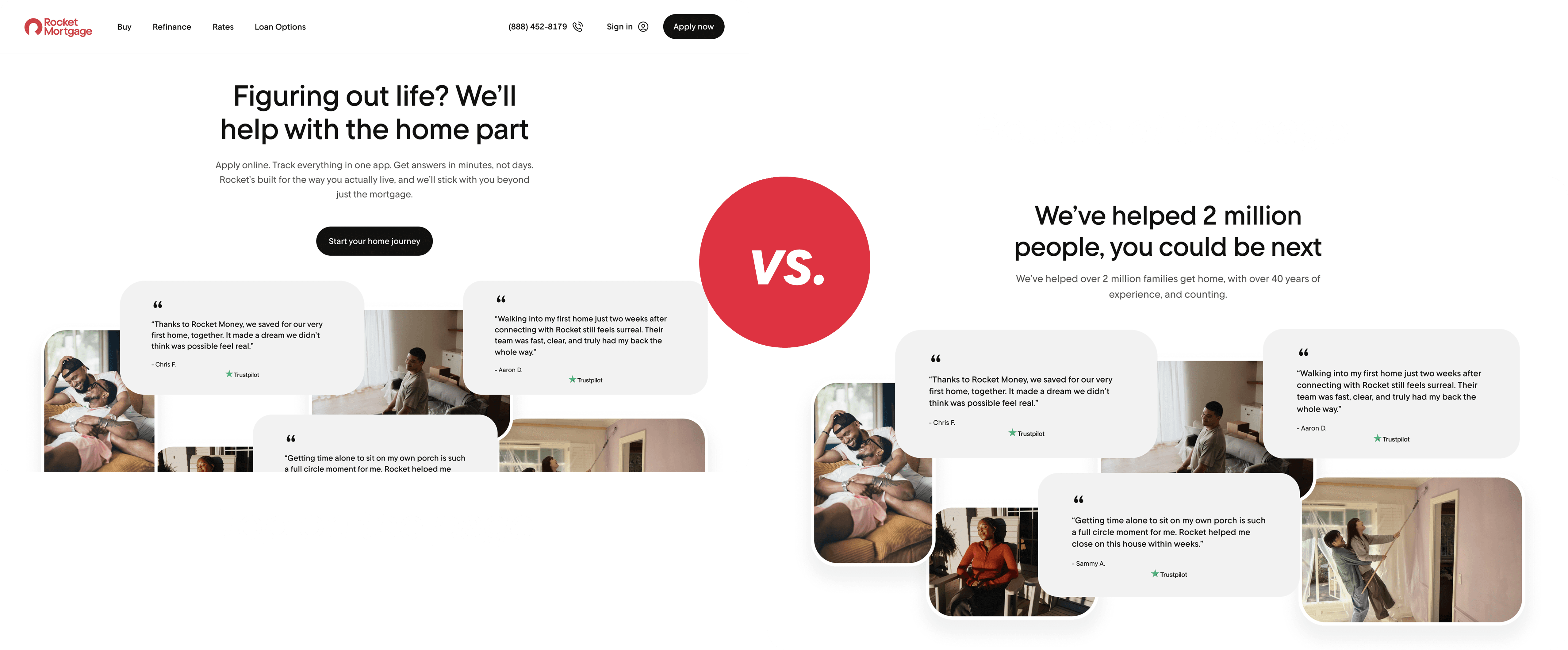
Would Testimonials be More Effective on The Top of the Page or Bottom?
Would Testimonials be More Effective on The Top of the Page or Bottom?
I wanted to test if Gen-Z might value peer credibility (testimonials) more if shown earlier in the flow. Therefore, I tested two placements: testimonials at the top vs. at the bottom of the page.
User Feedback
At the top → Users said they’d skip over it; felt less engaging as the first element.
At the bottom → Users appreciated the quotes and imagery more, saying they reinforced trust after seeing the main content first.
IMpact
Testimonials at the Bottom Resulted in More Positive Feedback
Testimonials at the Bottom Resulted in More Positive Feedback
Moving testimonials to the bottom increased positive reactions and strengthened credibility without disrupting the initial journey.
FINAL DESIGN:
Designing Confidence for Gen Z Homebuyers
Designing Confidence for Gen Z Homebuyers
A streamlined, Gen-Z–friendly flow with step-by-step guidance, diverse imagery, and supportive testimonials. 70% of users preferred the redesign for being more trustworthy and approachable.
Takeaways:
Wearing Multiple Hats and Navigating Layoffs
Wearing Multiple Hats and Navigating Layoffs
Rescoping with Intent - When my team was laid off mid-project, I learned to strategically re-scope and prioritize, focusing on high-impact methods like lean user testing and peer design reviews to keep the work user-centered despite resource constraints.
Feedback as a Design Tool – Actively seeking critique from multiple designers pushed the work further, sparking conversations about mobile vs. web limitations and helping me refine patterns that maintained consistency across platforms.
End-to-End Ownership – By taking on design, content strategy, and research synthesis, I strengthened my ability to connect insights to execution, building solutions that were not only visually polished but grounded in user needs.
Next steps:
Carrying the Story Forward
Expand testing across diverse Gen Z segments to uncover more nuanced needs and behaviors.
Explore new design patterns that feel conversational, inclusive, and socially native.
Refine content strategy to align with Gen Z’s expectations for transparency and relatability.
Inspire future work by building a foundation for product designers to create experiences tailored to the next generation of buyers.
designing for next-gen homebuyers
A strategic redesign of the Rocket Mortgage purchase flow, introducing educational entry points that increased user preference by 70% without disrupting the core experience.
Role:
Product Design Intern
Product Design
Intern
Tools:
Figma + FigJam
Maze
Rocket Design System
Microsoft Office Suite
Key Focus:
Visual Strategy
Cultural Research
Behavioral Analytics
Project Duration :
May 2025 - August 2025
Overview:
Architecting the Gen Z Purchase Journey
Architecting the Gen Z Purchase Journey
Architecting the Gen Z Purchase Journey
I spearheaded the redesign of Rocket Mortgage’s purchase experience, specifically engineered for the 18–28 demographic. Analytics revealed a significant gap in engagement and conversion among Gen Z users, which prompted an intensive study into their unique financial behaviors and digital expectations.
Using these behavioral insights as my foundation, I challenged traditional fintech design systems to create a mobile-first, high-integrity pathway. By testing iterations that prioritized radical transparency and conversational flow, I developed a visual strategy tailored to how the next generation navigates the complexities of digital finance.
PROBLEM:
Bridging the Generational Trust Gap
Bridging the Generational Trust Gap
Bridging the Generational Trust Gap
While Gen Z accounts for less than 3% of current homebuyers, they represent the future of the market. However, this demographic faces unique barriers, from economic setbacks to a deep-seated skepticism toward traditional administrative systems.
For a brand like Rocket Mortgage, whose mission is "Helping Everyone Home," the challenge was more than just a low conversion rate. The real problem was a visual and narrative misalignment: legacy fintech patterns felt cold and opaque to a generation that demands radical transparency, inclusivity, and digital-first simplicity. I needed to bridge this gap by translating Rocket’s brand promise into a visual language that felt earned, not just marketed.
SOLUTION:
Reimagining Design and Content for a Gen Z Mindset
Reimagining Design and Content for a Gen Z Mindset
Reimagining Design and Content for a Gen Z Mindset
Personalize the “Purchase” page to reflect Gen Z’s conversational style through vibrant, inclusive visuals and interactive elements that build trust and engagement from the first click.
SOLUTION FEATURES:
Your Six Steps to Home Sweet Home - Mobile Carousel
Your Six Steps to Home Sweet Home - Mobile Carousel
Your Six Steps to Home Sweet Home - Mobile Carousel
A mobile-first carousel that guides users through the home-buying process step by step. Partial visibility of the next item and progressive disclosure keep users engaged while making complex content more digestible.
More Relatable, Diverse Imagery
More Relatable, Diverse Imagery
More Relatable, Diverse Imagery
Created testimonial imagery featuring real Rocket customers and couples, with diverse and LGBTQ+ representation, to make the home-buying experience feel welcoming and inclusive. This approach addresses real-world inequities in homeownership, helps build trust with underrepresented audiences, and reinforces Rocket’s mission of truly “Helping Everyone Home.”
Reframing homebuying as a journey, not a destination
Reframing homebuying as a journey, not a destination
Reframing homebuying as a journey, not a destination
Redesigned content to reflect Rocket’s confidence and empathy, positioning homebuying as a journey, not a sales push, meeting Gen Z where they are with language that feels approachable, honest, and pressure-free.
Results:
A Clear Winner: 70% of Users Favored the Redesign
A Clear Winner: 70% of Users Favored the Redesign
A Clear Winner: 70% of Users Favored the Redesign
Six-step flowchart made the process clear and approachable
Colors reduced intimidation and improved engagement
Diverse imagery increased relatability
Users were 50% more likely to choose Rocket after the redesign
RESEARCH GOALS & QUESTIONS:
How might we make home-buying approachable, engaging, and confidence-inspiring for Gen Z, while reflecting their digital behaviors, values, and diverse identities?
How Might We Make Home-Buying Approachable, Engaging, and Confidence-Inspiring for Gen Z, while Reflecting Their Digital Behaviors, Values, and Diverse Identities?
How might we make home-buying approachable, engaging, and confidence-inspiring for Gen Z, while reflecting their digital behaviors, values, and diverse identities?
First Impression test
Did Gen Z trust the design at first glance?
Did Gen Z trust the design at first glance?
Users viewed a draft redesign for a few seconds and shared immediate reactions, helping me gauge if the design felt trustworthy, easy to follow, and if anything needed to be changed.
Testing the design: comparing original vs. New Design
Is Three Steps or Six Steps the Sweet Spot?
Is Three Steps or Six Steps the Sweet Spot?
Initial testing revealed that users found the three-step flow too simplified, making the home-buying process feel unrealistic and incomplete. Feedback highlighted the need for a design that felt more transparent and trustworthy.
DEsign Iteration
To address this, I redesigned the experience into a six-step roadmap, providing a clearer, more detailed breakdown of the process. I also shifted from heavy use of imagery to a visual roadmap format, which reduced cognitive overload and helped users focus on the steps themselves.
IMpact
Six Steps Is the Sweet Spot!
Six Steps Is the Sweet Spot!
The new design was seen as more eye-catching, approachable, and realistic, helping users better understand and engage with the process.
Testing the Design: comparing original vs. New Design
Would Testimonials be More Effective on The Top of the Page or Bottom?
Would Testimonials be More Effective on The Top of the Page or Bottom?
I wanted to test if Gen-Z might value peer credibility (testimonials) more if shown earlier in the flow. Therefore, I tested two placements: testimonials at the top vs. at the bottom of the page.
User Feedback
At the top → Users said they’d skip over it; felt less engaging as the first element.
At the bottom → Users appreciated the quotes and imagery more, saying they reinforced trust after seeing the main content first.
IMpact
Testimonials at the Bottom Resulted in More Positive Feedback
Testimonials at the Bottom Resulted in More Positive Feedback
Moving testimonials to the bottom increased positive reactions and strengthened credibility without disrupting the initial journey.
FINAL DESIGN:
Designing Confidence for Gen Z Homebuyers
Designing Confidence for Gen Z Homebuyers
A streamlined, Gen-Z–friendly flow with step-by-step guidance, diverse imagery, and supportive testimonials. 70% of users preferred the redesign for being more trustworthy and approachable.
Takeaways:
Wearing Multiple Hats and Navigating Layoffs
Wearing Multiple Hats and Navigating Layoffs
Rescoping with Intent - When my team was laid off mid-project, I learned to strategically re-scope and prioritize, focusing on high-impact methods like lean user testing and peer design reviews to keep the work user-centered despite resource constraints.
Feedback as a Design Tool – Actively seeking critique from multiple designers pushed the work further, sparking conversations about mobile vs. web limitations and helping me refine patterns that maintained consistency across platforms.
End-to-End Ownership – By taking on design, content strategy, and research synthesis, I strengthened my ability to connect insights to execution, building solutions that were not only visually polished but grounded in user needs.
Next steps:
Carrying the Story Forward
Expand testing across diverse Gen Z segments to uncover more nuanced needs and behaviors.
Explore new design patterns that feel conversational, inclusive, and socially native.
Refine content strategy to align with Gen Z’s expectations for transparency and relatability.
Inspire future work by building a foundation for product designers to create experiences tailored to the next generation of buyers.