EDITORIAL ART SPREADS FOR VIM MAGAZINE
Created multi-page editorial spreads for campus magazine reaching 50,000+ students, crafting visual narratives through typography, layout, and art direction.
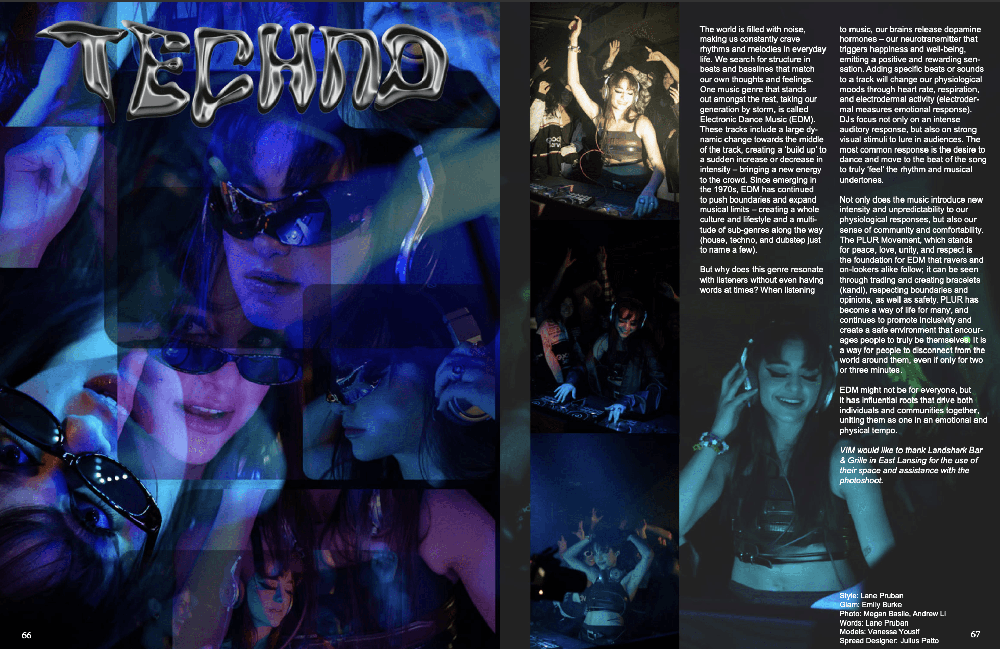
1. Techno
The Vision: An exploration of the underground club scene through a "digital-industrial" lens. This spread captures the euphoria and sensory overload of a techno set, translating auditory rhythms into a static, high-energy layout.
Chrome & Fluidity: I anchored the spread with a liquid-chrome header, using bubbly, metallic textures to create a futuristic, high-contrast focal point.
Visual Rhythm: To mimic the disorientation of strobe lights, I used layered transparencies and distorted, low-exposure photography. The goal was to make the images feel like they are "moving" to a beat.
The Digital Edge: Subtle pixelation and a deep neon palette bridge the gap between human emotion and the cold, precise machinery of electronic music.
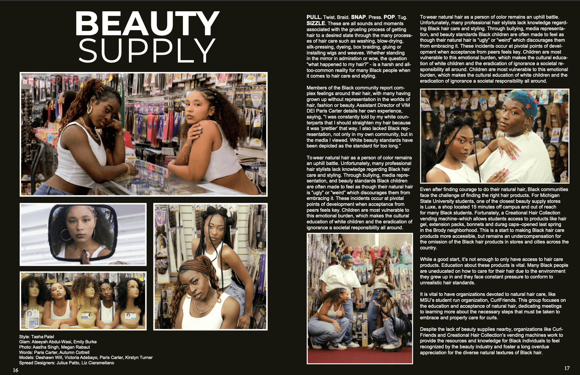
Beauty Supply
The Vision: A sensitive, human-centric feature focused on shedding light on the "invisible" aspects of chronic illness. This design aims to create a soft, welcoming space for personal vulnerability.
Organic Typography: Paired clean serifs with delicate, handwritten script to reflect the personal and unique voices of the interviewees.
Breathable Layout: Utilized an open, "airy" composition with minimal borders to emphasize the models' resilience and humanity.
Warmth & Contrast: Combined high-key studio photography with earthy, muted tones to move away from clinical associations and toward a feeling of warmth and visibility.
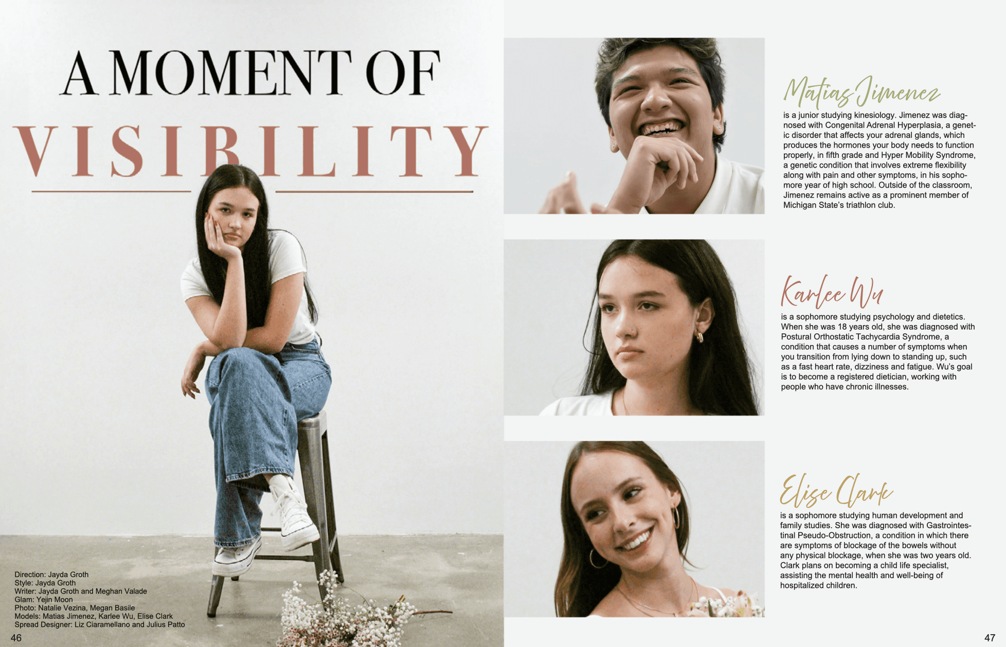
A MOMENT OF VISIBILITY
The Vision: A sensitive, human-centric feature focused on shedding light on the "invisible" aspects of chronic illness. This design aims to create a soft, welcoming space for personal vulnerability.
Organic Typography: Paired clean serifs with delicate, handwritten script to reflect the personal and unique voices of the interviewees.
Breathable Layout: Utilized an open, "airy" composition with minimal borders to emphasize the models' resilience and humanity.
Warmth & Contrast: Combined high-key studio photography with earthy, muted tones to move away from clinical associations and toward a feeling of warmth and visibility.
SCULPTED
The Vision: A high-fashion editorial inspired by classical Hellenistic sculpture. This spread explores the intersection of human form and architectural stability, creating a sense of timelessness and poise.
Classical Typography: Used a high-contrast, modern serif for the "SCULPTED" header to mirror the sharp lines of marble carvings.
Statuesque Composition: Organized images to emphasize verticality and posture, placing models on pedestals and alongside columns to blur the line between subject and stone.
Natural High-Contrast: Leveraged harsh, direct sunlight to create deep shadows and bright highlights, mimicking the way light hits a gallery sculpture.
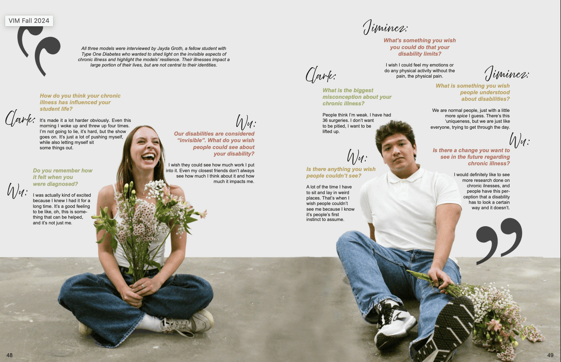
A MOMENT OF VISIBILITY
The Vision: A sensitive, human-centric feature focused on shedding light on the "invisible" aspects of chronic illness. This design aims to create a soft, welcoming space for personal vulnerability.
Organic Typography: Paired clean serifs with delicate, handwritten script to reflect the personal and unique voices of the interviewees.
Breathable Layout: Utilized an open, "airy" composition with minimal borders to emphasize the models' resilience and humanity.
Warmth & Contrast: Combined high-key studio photography with earthy, muted tones to move away from clinical associations and toward a feeling of warmth and visibility.
Beauty Supply
The Vision: A sensitive, human-centric feature focused on shedding light on the "invisible" aspects of chronic illness. This design aims to create a soft, welcoming space for personal vulnerability.
Organic Typography: Paired clean serifs with delicate, handwritten script to reflect the personal and unique voices of the interviewees.
Breathable Layout: Utilized an open, "airy" composition with minimal borders to emphasize the models' resilience and humanity.
Warmth & Contrast: Combined high-key studio photography with earthy, muted tones to move away from clinical associations and toward a feeling of warmth and visibility.
More to Discover


EDITORIAL ART SPREADS FOR VIM MAGAZINE
Created multi-page editorial spreads for campus magazine reaching 50,000+ students, crafting visual narratives through typography, layout, and art direction.
1. Techno
The Vision: An exploration of the underground club scene through a "digital-industrial" lens. This spread captures the euphoria and sensory overload of a techno set, translating auditory rhythms into a static, high-energy layout.
Chrome & Fluidity: I anchored the spread with a liquid-chrome header, using bubbly, metallic textures to create a futuristic, high-contrast focal point.
Visual Rhythm: To mimic the disorientation of strobe lights, I used layered transparencies and distorted, low-exposure photography. The goal was to make the images feel like they are "moving" to a beat.
The Digital Edge: Subtle pixelation and a deep neon palette bridge the gap between human emotion and the cold, precise machinery of electronic music.
Beauty Supply
The Vision: A sensitive, human-centric feature focused on shedding light on the "invisible" aspects of chronic illness. This design aims to create a soft, welcoming space for personal vulnerability.
Organic Typography: Paired clean serifs with delicate, handwritten script to reflect the personal and unique voices of the interviewees.
Breathable Layout: Utilized an open, "airy" composition with minimal borders to emphasize the models' resilience and humanity.
Warmth & Contrast: Combined high-key studio photography with earthy, muted tones to move away from clinical associations and toward a feeling of warmth and visibility.
A MOMENT OF VISIBILITY
The Vision: A sensitive, human-centric feature focused on shedding light on the "invisible" aspects of chronic illness. This design aims to create a soft, welcoming space for personal vulnerability.
Organic Typography: Paired clean serifs with delicate, handwritten script to reflect the personal and unique voices of the interviewees.
Breathable Layout: Utilized an open, "airy" composition with minimal borders to emphasize the models' resilience and humanity.
Warmth & Contrast: Combined high-key studio photography with earthy, muted tones to move away from clinical associations and toward a feeling of warmth and visibility.
SCULPTED
The Vision: A high-fashion editorial inspired by classical Hellenistic sculpture. This spread explores the intersection of human form and architectural stability, creating a sense of timelessness and poise.
Classical Typography: Used a high-contrast, modern serif for the "SCULPTED" header to mirror the sharp lines of marble carvings.
Statuesque Composition: Organized images to emphasize verticality and posture, placing models on pedestals and alongside columns to blur the line between subject and stone.
Natural High-Contrast: Leveraged harsh, direct sunlight to create deep shadows and bright highlights, mimicking the way light hits a gallery sculpture.
A MOMENT OF VISIBILITY
The Vision: A sensitive, human-centric feature focused on shedding light on the "invisible" aspects of chronic illness. This design aims to create a soft, welcoming space for personal vulnerability.
Organic Typography: Paired clean serifs with delicate, handwritten script to reflect the personal and unique voices of the interviewees.
Breathable Layout: Utilized an open, "airy" composition with minimal borders to emphasize the models' resilience and humanity.
Warmth & Contrast: Combined high-key studio photography with earthy, muted tones to move away from clinical associations and toward a feeling of warmth and visibility.
Beauty Supply
The Vision: A sensitive, human-centric feature focused on shedding light on the "invisible" aspects of chronic illness. This design aims to create a soft, welcoming space for personal vulnerability.
Organic Typography: Paired clean serifs with delicate, handwritten script to reflect the personal and unique voices of the interviewees.
Breathable Layout: Utilized an open, "airy" composition with minimal borders to emphasize the models' resilience and humanity.
Warmth & Contrast: Combined high-key studio photography with earthy, muted tones to move away from clinical associations and toward a feeling of warmth and visibility.
More to Discover
EDITORIAL ART SPREADS FOR VIM MAGAZINE
Created multi-page editorial spreads for campus magazine reaching 50,000+ students, crafting visual narratives through typography, layout, and art direction.
1. Techno
The Vision: An exploration of the underground club scene through a "digital-industrial" lens. This spread captures the euphoria and sensory overload of a techno set, translating auditory rhythms into a static, high-energy layout.
Chrome & Fluidity: I anchored the spread with a liquid-chrome header, using bubbly, metallic textures to create a futuristic, high-contrast focal point.
Visual Rhythm: To mimic the disorientation of strobe lights, I used layered transparencies and distorted, low-exposure photography. The goal was to make the images feel like they are "moving" to a beat.
The Digital Edge: Subtle pixelation and a deep neon palette bridge the gap between human emotion and the cold, precise machinery of electronic music.
Beauty Supply
The Vision: A sensitive, human-centric feature focused on shedding light on the "invisible" aspects of chronic illness. This design aims to create a soft, welcoming space for personal vulnerability.
Organic Typography: Paired clean serifs with delicate, handwritten script to reflect the personal and unique voices of the interviewees.
Breathable Layout: Utilized an open, "airy" composition with minimal borders to emphasize the models' resilience and humanity.
Warmth & Contrast: Combined high-key studio photography with earthy, muted tones to move away from clinical associations and toward a feeling of warmth and visibility.
A MOMENT OF VISIBILITY
The Vision: A sensitive, human-centric feature focused on shedding light on the "invisible" aspects of chronic illness. This design aims to create a soft, welcoming space for personal vulnerability.
Organic Typography: Paired clean serifs with delicate, handwritten script to reflect the personal and unique voices of the interviewees.
Breathable Layout: Utilized an open, "airy" composition with minimal borders to emphasize the models' resilience and humanity.
Warmth & Contrast: Combined high-key studio photography with earthy, muted tones to move away from clinical associations and toward a feeling of warmth and visibility.
SCULPTED
The Vision: A high-fashion editorial inspired by classical Hellenistic sculpture. This spread explores the intersection of human form and architectural stability, creating a sense of timelessness and poise.
Classical Typography: Used a high-contrast, modern serif for the "SCULPTED" header to mirror the sharp lines of marble carvings.
Statuesque Composition: Organized images to emphasize verticality and posture, placing models on pedestals and alongside columns to blur the line between subject and stone.
Natural High-Contrast: Leveraged harsh, direct sunlight to create deep shadows and bright highlights, mimicking the way light hits a gallery sculpture.
A MOMENT OF VISIBILITY
The Vision: A sensitive, human-centric feature focused on shedding light on the "invisible" aspects of chronic illness. This design aims to create a soft, welcoming space for personal vulnerability.
Organic Typography: Paired clean serifs with delicate, handwritten script to reflect the personal and unique voices of the interviewees.
Breathable Layout: Utilized an open, "airy" composition with minimal borders to emphasize the models' resilience and humanity.
Warmth & Contrast: Combined high-key studio photography with earthy, muted tones to move away from clinical associations and toward a feeling of warmth and visibility.
Beauty Supply
The Vision: A sensitive, human-centric feature focused on shedding light on the "invisible" aspects of chronic illness. This design aims to create a soft, welcoming space for personal vulnerability.
Organic Typography: Paired clean serifs with delicate, handwritten script to reflect the personal and unique voices of the interviewees.
Breathable Layout: Utilized an open, "airy" composition with minimal borders to emphasize the models' resilience and humanity.
Warmth & Contrast: Combined high-key studio photography with earthy, muted tones to move away from clinical associations and toward a feeling of warmth and visibility.